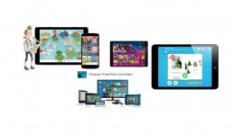
The Problem
motivate the quantity and quality of young users’ reading, which unfortunately seems to be a growing educational problem at the United States as the majority of children are having a hard time with reading and comprehending texts.
The barrier
This was quite a challenging project due to the
• Time crunch: The product was to be designed, developed and released in two months, which left the design team only 2 weeks to design and communicate the entire product to the investors and the developers.
• The number of teams and team members: Fortunately, we had to work with an army of skilled designers and developers, three teams of 20+ to be exact; however, that meant increased chances of conflicts and miscommunications within and between the teams.
• The standards: The design decisions were not only focused to please the users, but every decision we made had to meet the expectations and standards of the investors and later, the apple app store.
My Role
Call me the peacemaker! As the Lead UX designer assigned to the project I was responsible for leading the UX team and communicating the design to the entire team to make sure that everyone involved fully understands the product and the target users and that we are all on the same page.
The Beginning Of Reading IQ
I've worked for Age of Learning for more than four years on Several projects such as publishing tools, MRT App, Zoo App Music app videos, ABCmouse Library &, etc.
It was Friday morning in June 2018 that our entire Team called up in a meeting room to assigned us with a huge! challenge
"To Create most curated online library app that will empower children to read more books and aspiring teachers to use this technology to promote reading in schools around the world."
And here is the breaking news! We should lunch the app by the beginning of school.
Research & empathize
My first stage involved collecting all the user data such as competitive analysis and to come up with the best possible design solution.
Using our findings,
Given the time limitations and the large number of people involved in the project I decided that the most efficient way to keep communication going is to hold daily whiteboarding session with the UX team, where I guided my team to design around common design patterns with proven success while staying true to the company’s identity and style guides.
After the whiteboarding session, I used our team decisions to design our web and mobile architecture and site map so that everyone involved in the project could understand the basic idea and the overall flow of the product.
Wireframing
Since our product was designed to be used not only at home but also at school environment, we created two teacher-focused and student-focused wireframes in two teams, so that each team could focus on the specific needs of the assigned target group.
Once done with the wireframes, we evaluated the two to make sure that they are cohesive and follow appropriate design patterns.
Prototyping
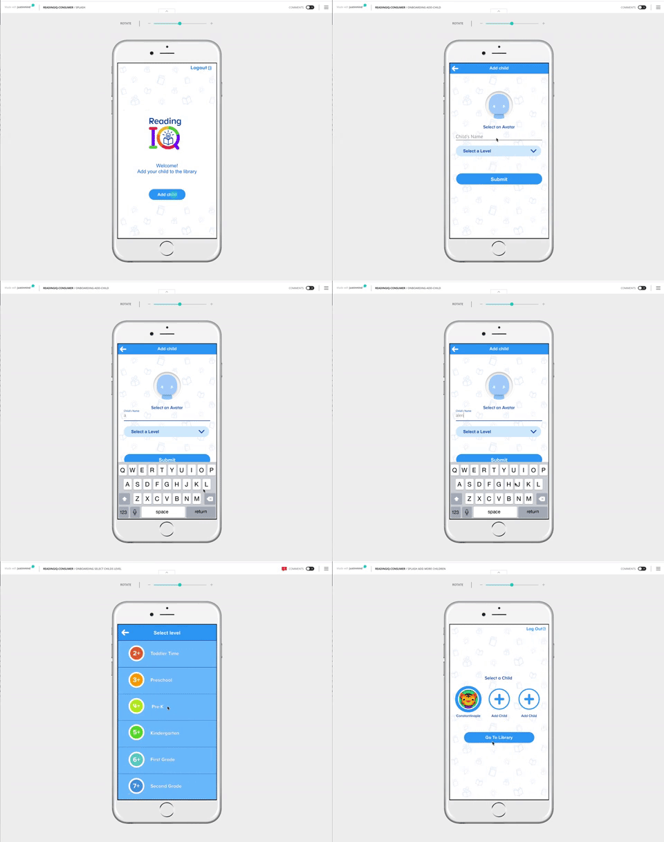
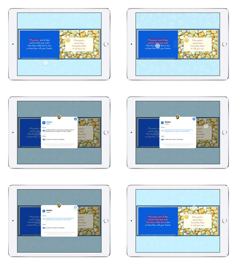
I then created a high-fidelity prototype of the product and worked with the research team to test it with parents, teachers, and children.
User Testing & Production
Once we fixed all the design and usability issues and got the approval of the investors, we moved to the production phase where I had to maintain a clear and ongoing communication between the teams and to ensure that the developers fully understand the design and that there are no unexpected issues and concerns.
And the big reveal!
After two months of hard work, we were able to publish the product on time, and our app was featured on the apple app store.

